Bye Bye Smart Band Management
We are officially saying BYE BYE to smartbandmanagement.com the domain we’ve had for over 6 years. I began Smart Band Management the blog in 2013 for the purpose of sharing free artist management information both from what I was learning and from my interviews with experts. Come 2017, I created a super in-depth course and started a “school” called Smartist University to house this new course.
For a few years, we’ve been managing two websites, SmartBand Management.com and SmartistU.com, but the time has come to merge them. Over the past few months we’ve been working on a new website, and on Valentine’s Day, two will become one. SmartistU.com will merge “onto” SmartBandManagement.com. The blog will remain, and now all of our courses and products will also be available on the one website. But it’s not just the website that has received a makeover, so has our branding as a whole.
We will be revealing a new logo tomorrow (Thursday, February 13th)! In honour of the new website and new branding, let’s take a look at the evolution of our logos!
Did you know that the very first iteration of smartistU, even before Smart Band Management, was “BandManagementCompanies.com”? Yep, when I originally started the website, it was I intention to create an artist management company directory along with advice blogs.
After realizing how incredibly difficult it is to keep track of thousands of companies around the globe that close and open their doors daily, I gave up that idea.
2013: Very First Logo

A year later, I changed the domain to SmartBandManagement.com, and this logo was formed.
2014: Name Change

A few months later this shade of yellow on black started making me cringe, so I thought, ‘perhaps a brighter yellow shall do the trick’.
Later 2014: Shade of Yellow Change

Then a dash of dimension.

Then when circle display pics started to become popular, it gave us the idea to make our logo into a circle, and add the lightheartedness of the bright aqua-blue behind it.
2016: Added Some Life

Then came 2017, when I was going through a grey and mint phase.
2017: Grey and Mint Phase

My business partner (and our web designer) absolutely hated it (rightly so), so he made me keep a plain back one on hand.

Today, this remains the Smart Band Management logo.
UNTIL TOMORROW.
Then came 2018, the start of our second website to house our online courses and membership program.
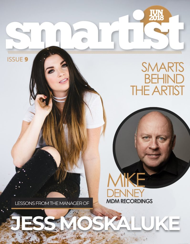
I had been dreaming up the name “Smartist University” for a year or so, and it came time to start using it.
2018: The Sister Brand Name

And somehow I was convinced to bring that yellow back in, but tried to make it more modern and gold-like.

Then we decided to align it with SBM with a similar logo style.
2019: Maturity

Sigh. Simplicity.
Then we made a crest/emblem for a dash of playful collegiate vibes.


Today (February 12th, 2020), this remains the Smartist University aka SmartistU logo… until tomorrow when we reveal our new logo.
[ARTICLE UPDATE: February 20, 2020]
2020: NEW BRANDING

The new logo is SIMPLE, FRESH, BOLD and MODERN. We analyzed hundreds of designs from several designers and spent hours tweaking it to perfection. And we are so excited to share it with you.
All smartistU course + toolkit buyers gain access to our private group. So we also had a “secret” second logo made for our students/members-only group, The Green Room.

Whether you’ve been with me/us since 2013, or just found us 5 minutes ago, I’m so happy you’re on this journey with us, helping us build a global business from scratch. Helping us change the lives of many, and the way business is done in the music industry.
Jamie


Responses